A screenshot shows one screen. It can't say how to build it.
| My scope | The Figma screens, the handoff model, the Playground, the page list, the port of tokens and components, the note standard, and the page builds |
| Not mine | The backend and the QA frontend |
| Headline outcome | 100 pages and 41 modals in one code handoff. 29 pages and 24 modals moved to QA |
An engineer opens a Figma link. It shows one screen, at one width, in one state. It doesn’t say which component to use, which spacing sets the gap, or which screen comes next. So the engineer guesses, and so do the AI agents that build most of our pages. The guesses pass review, and then someone builds the page again.
We are three people, with no design team. Figma’s AI connector (the Figma MCP) could read the file, but it still guessed. The handoff needed to be a different thing. I had designed the screens myself, so I built one: the Playground.
An engineer opens a Figma link. It shows one screen, at one width, in one state. It doesn’t say which component to use, which spacing sets the gap, what shows when the list is empty, or which screen comes next. So the engineer guesses, and so do the AI agents that build most of our pages. The guesses pass review, and then someone builds the page again.
We are three people, with no design team, so review time is scarce. Figma’s AI connector (the Figma MCP) could read the file, even the icon shapes, but it still rebuilt the page from guesses. The handoff didn’t need to be more precise. It needed to be a different thing.
I designed the screens in Figma myself. The Playground was my idea too: move all design and layout work into it. I built every page with Claude as the build agent, and I checked each one against our design rules. The AI Dev and the PM chose which pages went into QA, the test version of the product before release.
The problem
An engineer opens a Figma link, or a screenshot in a ticket. It shows one screen, at one width, in one state. It doesn’t say which component to use, which design token sets the gap (tokens are the named values for colour, spacing and type), what shows when the list is empty, or which screen comes next.
So the engineer guesses. So do the AI agents that now build most of our pages. The guesses are plausible enough to survive review, and wrong enough that someone builds the page again.
That cost landed on the build. Each page became a reconstruction. We argued about the same spacing and the same component choices in every review. At a three-person company, review attention is the thing we have least of. And a page that only looked close had a second cost: the next agent learned from the copy, not from the system.
My first try was to make Figma’s AI connector (the Figma MCP, which lets an agent read a Figma file) give a 1:1 result. It could read the file, with its layers and the shapes of the icons. But it still rebuilt the page from guesses. The real problem was the medium. A static file can’t carry the system’s decisions, or the flow from one screen to the next.
I started out trying to make the handoff more precise. The problem was what the handoff was.
What I had to work with
- Schedule Ventures is three people: one UI/UX designer (me), one AI Dev and one PM/CSO. There is no design team to absorb the rebuilds.
- Figma stayed the source of design decisions. I did not set out to replace it.
- The product runs on Next.js (App Router), TypeScript and MUI. The handoff had to use the same stack, or it would create a third dialect.
- The Playground has no backend. Its data is mocked, and every place where real behaviour belongs is marked in the code.
- The catalog had to cover six projects: Law Firm, Super Admin, Individual Customer, Static Pages, Error Pages and Tooling.
- Moving pages into QA (the test site, the step before release) is separate work. The Playground could be ahead of the product, and often was.
- No baseline. Before the build, I did not log time per page, review comments or defect rates.
My role
I designed the Figma screens. I also owned the idea, the Playground itself, the page list (the registry), the port of tokens and components, the note standard and the page builds. I directed Claude as the build agent and checked its output against our token and component rules. The AI Dev and the PM owned product scope and the queue of pages going into QA. Frontend engineers wired the moved pages to live data. The backend and the QA release were not mine.
The AI could read the file. It couldn't read the decisions.
I tried three handoffs in turn: a screenshot, code made straight from Figma, and a page coded in our own stack. Only the coded page stopped the guessing. The connector can’t know that this button is our standard button (BaseButton) or that this gap is step 3 on our spacing scale. Those choices live in the design system, not in Figma.
I tried three handoffs in turn: a Figma frame with a screenshot, code made straight from Figma by the connector, and a page coded in our own stack. Only the coded page took the guessing away. The connector reads a file. It can’t know that this button is our standard button (BaseButton), that this gap is step 3 on our spacing scale, or that this modal belongs to the checklist family. Those choices live in the design system, not in Figma, so the agent filled them in with something close.
I learned a second thing too: the page had to be its own documentation. A separate spec drifts away from the code. The questions an engineer asks belong next to the code that answers them.
I compared three handoffs, one after another
This was a sequence of trials, not a controlled study. I tried three ways to hand over a page: a Figma frame with a screenshot, code made straight from Figma by the connector, and a page coded by hand in the product’s stack. The catalog started with two pages, the 404 pages for logged-out and logged-in visitors. It grew to 100 pages across six projects.
The first lesson: the connector is a reader, not a compiler. It could return the layers, and the shapes of the icons. It could not return the decision that this is a BaseButton, that this gap is spacing[3], or that this modal belongs to the checklist family. Those decisions lived in the design system, not in the Figma file. So the model filled them in with something close.
The second lesson: the page had to be the documentation. A separate spec would drift away from the code. The questions behind every handoff were always the same. What is this for? When does it show? What does each part do? What can you do with it? What happens at the edges? Those answers belonged next to the code.
So I changed direction. I stopped trying to make a static picture produce a precise build. I put the system into the thing I handed over: build each page in the product’s stack, write its purpose into the code, and link the screens so anyone can walk the flow.
Build the handoff in the product’s own code
Rejected: Better screenshots and flow diagrams with notes.
Why not. Still one state per picture. The reader still has to rebuild the tokens, the components and the behaviour.
Rejected: Code made straight from Figma by the connector.
Why not. Plausible code, but not 1:1. The system's choices were missing, and there was no working flow.
The agent now reads the real component, the real token and the real note about what is missing.
The connector stayed useful for assets and icon shapes, as an input, not as the result.
Cost: a second copy of every page to maintain. The Playground can drift away from QA, and that drift is now my problem.
Make each page explain itself
Rejected: A separate spec in Notion or Confluence.
Why not. It comes apart from the code and goes stale.
Rejected: A Storybook-only component browser.
Why not. It shows components on their own, not the page or the flow.
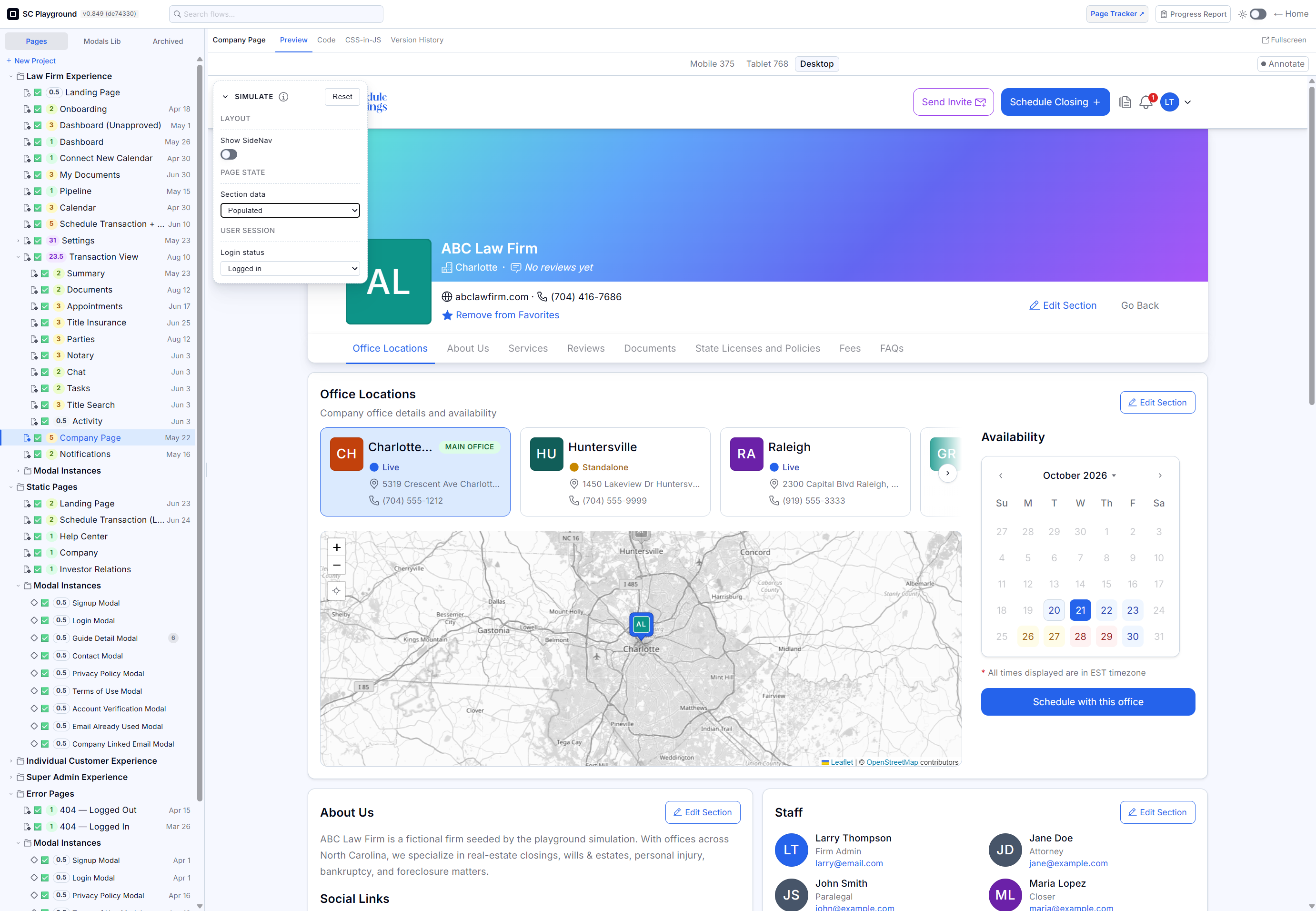
I kept the shell plain on purpose, so the page inside it is the only thing that looks like the product. Each page links to the next screen, so a reviewer walks the flow instead of reading a sitemap.
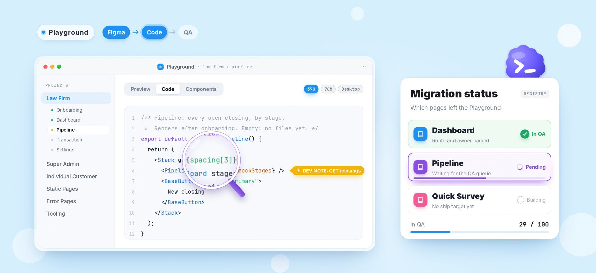
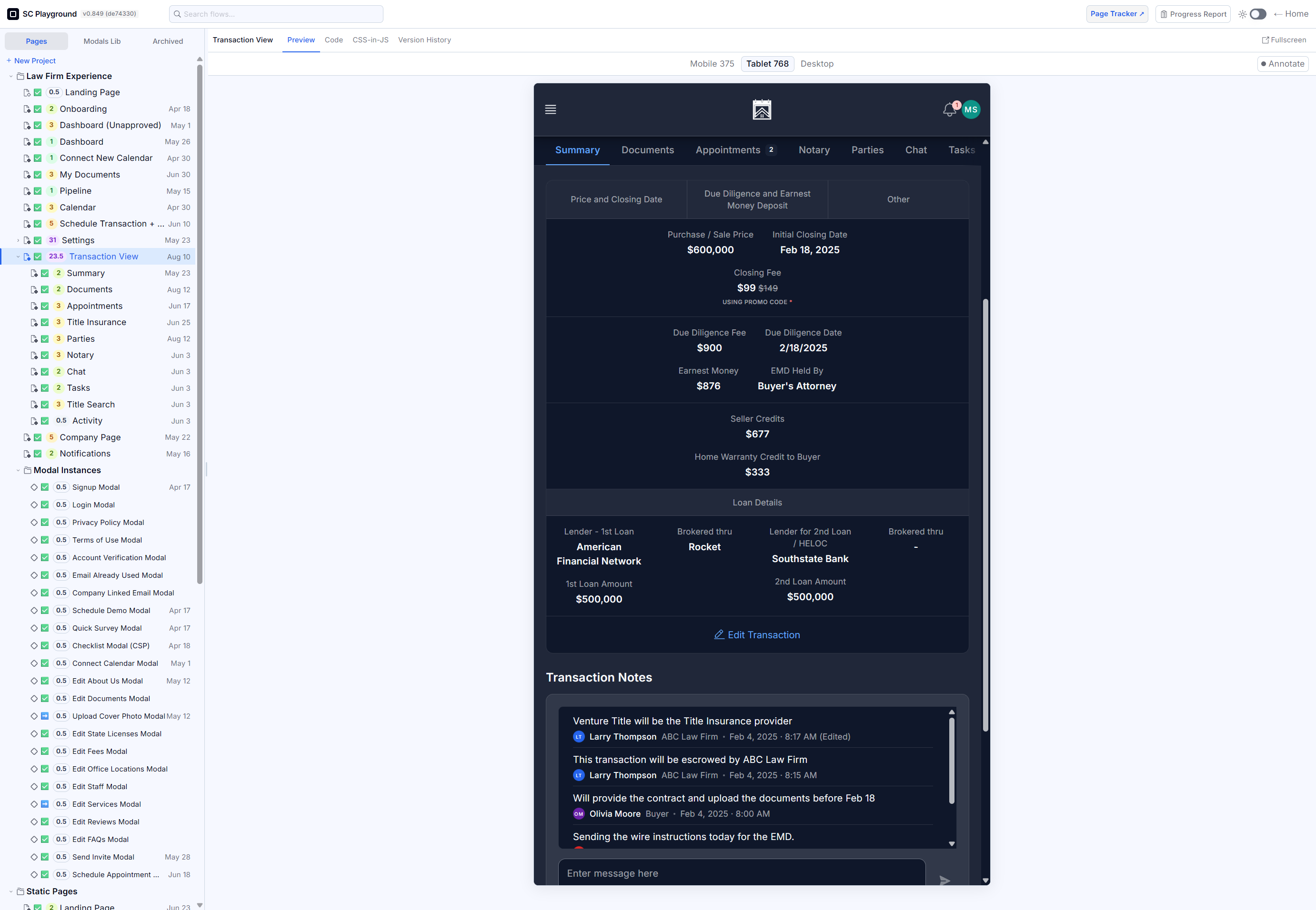
Each handoff question gets its answer where the code is. Preview shows the page at 390, at 768 and at desktop width. Code shows the source and the places marked for real data. Components shows what the page is made of. And each page links to the next screen, so a reviewer can walk the flow instead of reading a sitemap.
Cost: building the shell, and keeping the page list honest. Every page needs an entry, and every entry has to stay true.
Write the intent and the status into the page
Rejected: Keep the code clean and explain it in review.
Why not. The explanation is gone when the call ends.
Rejected: Comment everything.
Why not. It's noise, and comments rot.
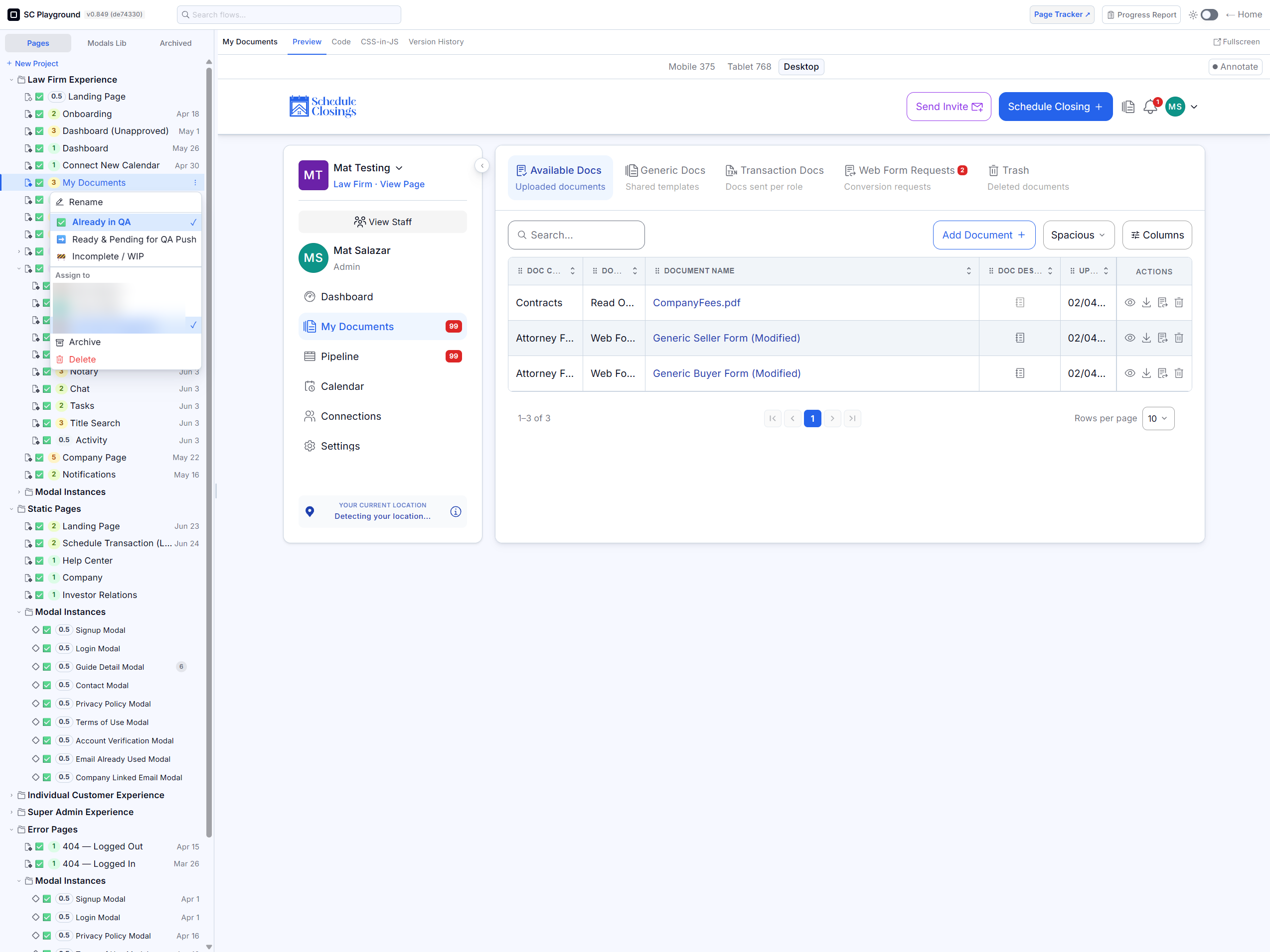
Every page carries its purpose, what makes it show, what each part does, its interactions and its edge cases. Anything the agent must add is a DEV NOTE: a route, an API call, a modal trigger, a setting. The page list gives each page a status: In QA, Pending QA, Building, or none. So the catalog shows what has moved, not only what exists.
Cost: questions up front, and a job that never ends. A stale comment is worse than no comment.
Every page is a real page, with its code and its status beside it
Before: a Figma link and a screenshot. The engineer or the agent opens it, guesses the gap, picks a component, asks about the empty state, and builds a page that looks close.
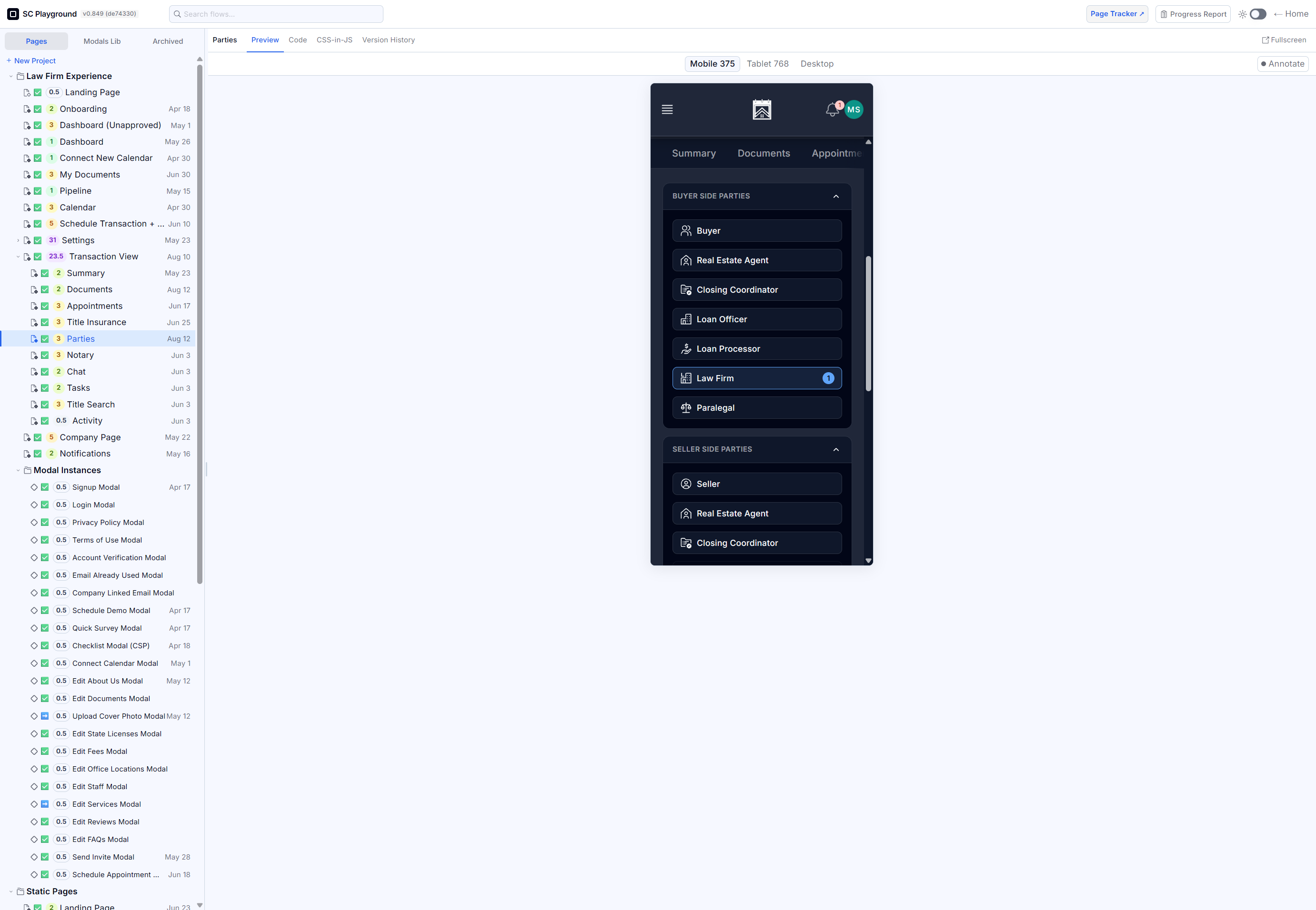
After: one web address with a sidebar of projects and pages. Each page opens with its preview, its code and its components side by side, and it links to the next step in the flow.
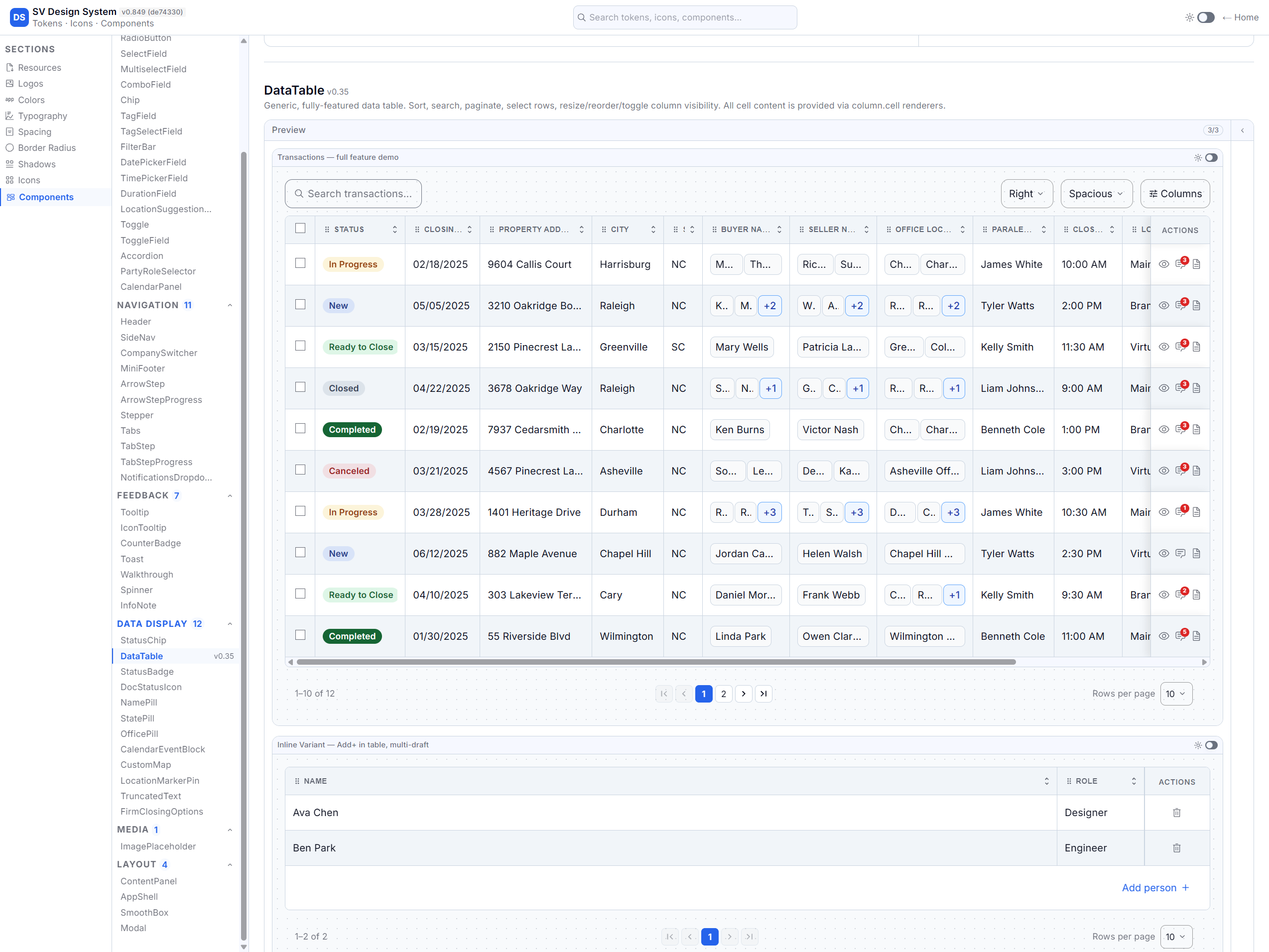
The preview is the real page, built from 65 components. An agent now gets a page path, not an image: keep its components and tokens, and replace the mock data where a note in the code says.
The preview is the real page, not a mock, and the code is the same code it runs. Under it sit 65 components, 41 modals and 100 pages. The handoff to an agent is now a page path, not an image: read the page, keep its components and tokens, and replace the mock data where a note in the code (a DEV NOTE) says.
Each page also shows its status (In QA, Pending QA or Building), so nobody mistakes the catalog for the product.
The preview is the real page, not a mock. The code is the same code the page runs. The Components tab lists what it uses. The code carries the tokens and the notes on what is still missing.
Under it sit 65 components, 41 modals and 100 catalogued pages. The tokens cover colour, colour by meaning (semantic colour), spacing, type, corner radius, shadows and breakpoints. The rules hold the small decisions:
- Semantic colours only.
- Text never smaller than 14px.
- A 12px gap when Figma doesn’t give one.
- An existing component before a new one.
- No hand-typed radius or shadow.
The handoff to an agent is a page path and a stack, not an image. “Build this, here’s how it works” becomes literal: read the page, keep its components and tokens, and replace the mock data where the DEV NOTE says. Those notes are the seam between design and backend, and the only place an agent should add behaviour.
Linking the flow matters more than a gallery. One page answers what one screen looks like. Linked pages answer what happens next, which is exactly where agents usually invent behaviour. The Law Firm flow runs from the landing page and onboarding through the dashboard, the pipeline, a transaction and the settings. The modal library sits beside it: 41 modals, used 60 times across the projects.
The shell itself stays plain, with neutral colours and MUI’s default look, so the preview is the only thing on screen that looks like the product. The tool doesn’t compete with the page.
The status is part of the page, not a separate report. On 24 June, the page list held 29 pages in QA, 26 waiting for QA, 41 still being built and 4 with no status. That badge is the difference between a design reference and a page that moved, and it stops a reader from mistaking the catalog for the product.
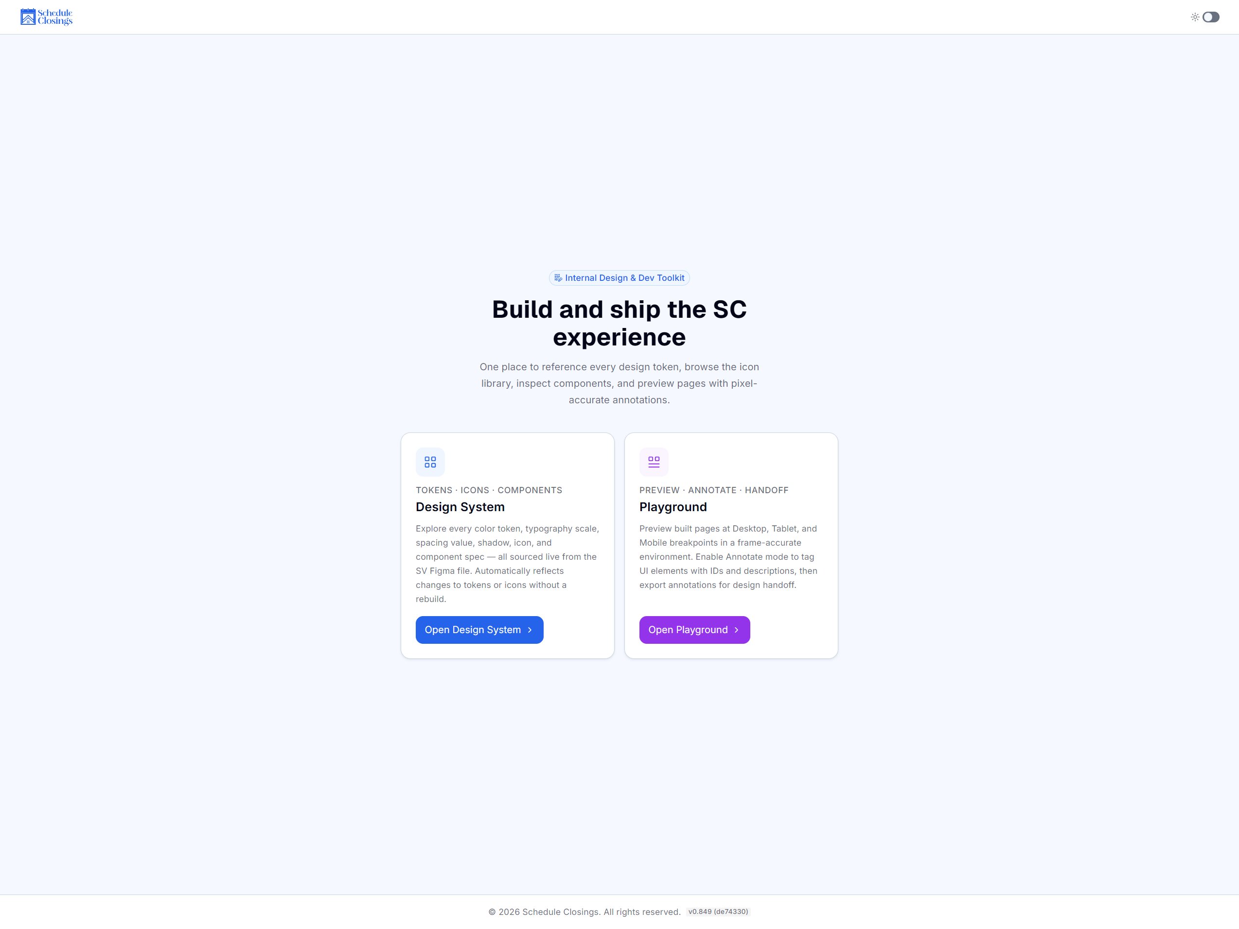
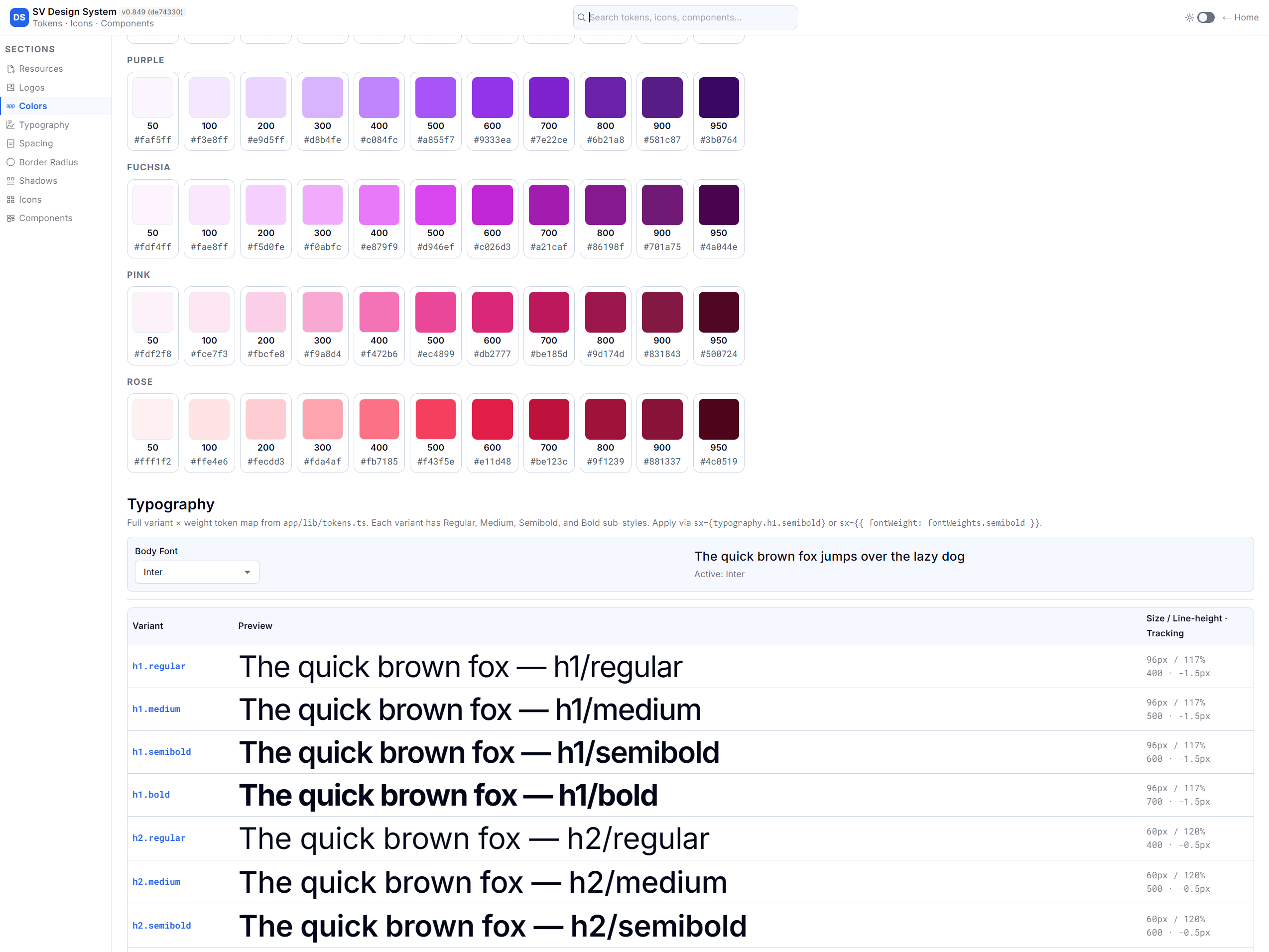
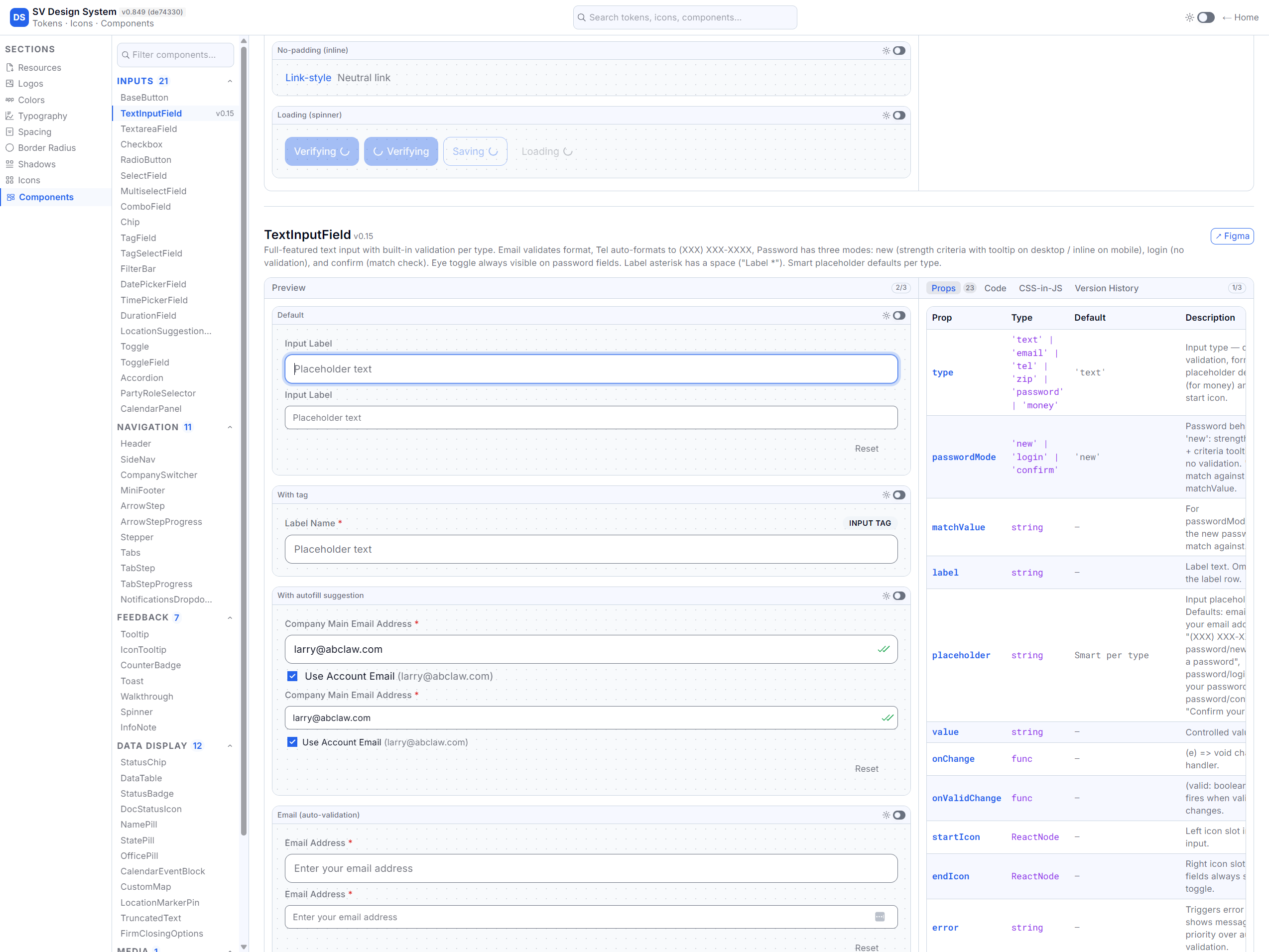
The number that matters is not 100. It's 29.
| Metric | Before | After | Window |
|---|---|---|---|
| Catalogued pages | 2 seed pages | 100 pages across 6 projects | 20 March to 24 June |
| Modal library | 0 | 41 modals, 60 instances | 24 June |
| Pages moved to QA | 0 from the Playground | 29 in QA, 26 pending, 41 building, 4 no status | 24 June |
| Modals moved to QA | 0 | 24 of 41 | 24 June |
| System decisions in code | Screenshots and prose | 65 components, 7 token modules, token and component rules | 24 June |
| Time per page | No baseline | No controlled result | Not measured |
| Handoff questions per page | No baseline | No controlled result | Not measured |
These are not productivity numbers. They show reach and adoption. I didn’t run a controlled comparison, so I can’t claim a time saving or fewer defects.
What I can defend: 29 pages and 24 modals reached QA from code, not screenshots, in 14 weeks with three people. But 41 pages were still being built. The catalog ran ahead of the product.
What I would change: measure from the first page, and give every page a named QA route and owner before it counts as done.
The strongest claim I can make is this: 29 pages and 24 modals entered QA from a handoff that is code, not a screenshot. And the catalog reached 100 pages in 14 weeks with a three-person team.
The change I can describe without a number is the handoff itself. It’s a working page with its code, its components and its status. A reader no longer has to interpret a picture to know what to build. That’s qualitative, but it’s the change the tool was built for.
Two results keep the claim honest:
- On 6 May I checked 20 pages and 20 modals against QA. Three public header links led to 404 pages in QA. One onboarding page was much simpler than its Playground version. Six modals had no clear match in the product. Code didn’t guarantee the move.
- On 24 June, 41 pages were still being built. The catalog ran ahead of the queue. A page in the Playground is not a page shipped.
The part of the catalog that stopped being a reference is the 29 in QA. The 41 still being built show how far a handoff can run ahead of the product.
What I would do differently
I treated the page count as progress. It was output. The number in QA was the outcome, and it was lower.
I would measure from the first page: how long each page takes, how many questions it raises, and how the Playground and QA differ. And I would make a named QA route and owner part of “done” for every page.
I would measure from page one: how long each page takes, how many handoff questions it raises, and the difference between the Playground and QA for the first 20 pages. Then I would compare the next 20 built from screenshots with 20 built from code, with the same scope and the same reviewers. Without that baseline, this case study can claim reach, but not efficiency.
I would make the move to QA part of the definition of done: no page without a named QA route and an owner. The audit found pages that only exist in the Playground: two transaction variants, Quick Survey and Schedule Demo. Each cost a production-quality build, and none had a confirmed ship target. I would also check each page as it moves: the route exists, the sections match, the modal family matches, and it behaves the same at every width. The 6 May audit was done by hand, after the catalog had already grown. It should have been a gate.
I would keep the five questions, but treat a stale note as a bug. They’re cheap at the start and expensive to rebuild later.
The short version
Problem. The handoff was a screenshot. It carried one state and none of the system’s decisions. Engineers and AI agents rebuilt the spacing, the components and the behaviour, close enough to pass review and wrong enough to rebuild.
Decision. Build the handoff in the product’s own stack, make each page explain itself, and write the intent and the status into the page.
Constraint. Three people, no design team, Figma stays the design source, and code straight from Figma was not 1:1.
Outcome. 100 pages, 41 modals and 65 components. 29 pages and 24 modals in QA after 14 weeks. No measured time saving.
Why not just write a better prompt for the connector? The connector reads the file. It doesn’t hold the component and token decisions, or the flow. A better prompt would still rebuild from guesses.
Did this replace the designer? No. I still designed every screen in Figma, and Figma stayed the source of design decisions. The Playground replaced the screenshot as the thing you build from. It holds decisions. It doesn’t make them.
What did it cost? A second codebase, a page list to keep true, and drift between the two. 41 pages were still being built when the catalog reached 100.
Evidence
- The Playground’s
README.mdanddocs/plans/2026-03-20-playground-design.md: the idea, the shell and the three panels. docs/plans/2026-03-20-figma-annotation-workflow-design.md: the five questions and theDEV NOTEhabit.docs/playground-page-status-2026-06-24.md: 100 pages, 29 in QA, 26 pending QA, 41 building, 4 with no status.sc-frontend/docs/boondoggle/qa-playground-parity-audit-2026-05-06.md: 20 pages, 20 modals, the public links that 404, the onboarding mismatch and the modals with no match.app/playground/playground-config.json: the page and modal list, with each status and each modal’s uses.app/components: 65 component files.app/lib/tokens: colour, semantic colour, spacing, type, radius, shadow and breakpoint modules.- The live Playground at
/playgroundon the Schedule Closings sandbox.