Every fix took a minute, and every fix landed on me
| My scope | The idea and the proposal to run it in CI, the rules, the component guide, the design checklist, the AI reviewer, the test set, and the design instructions the agents load |
| Not mine | Frontend product work, our component library, and the build pipeline |
| Headline outcome | 12 automatic rules that were right every time, an AI reviewer right 96.9% of the time at best, and six design calls moved from my eye to code |
A developer asks to add new screens to the product. That request is a pull request, or PR. I open it, and I see the wrong font again. Then a gap that isn’t on our spacing scale. Then a stock component, where our own component library already has the right one.
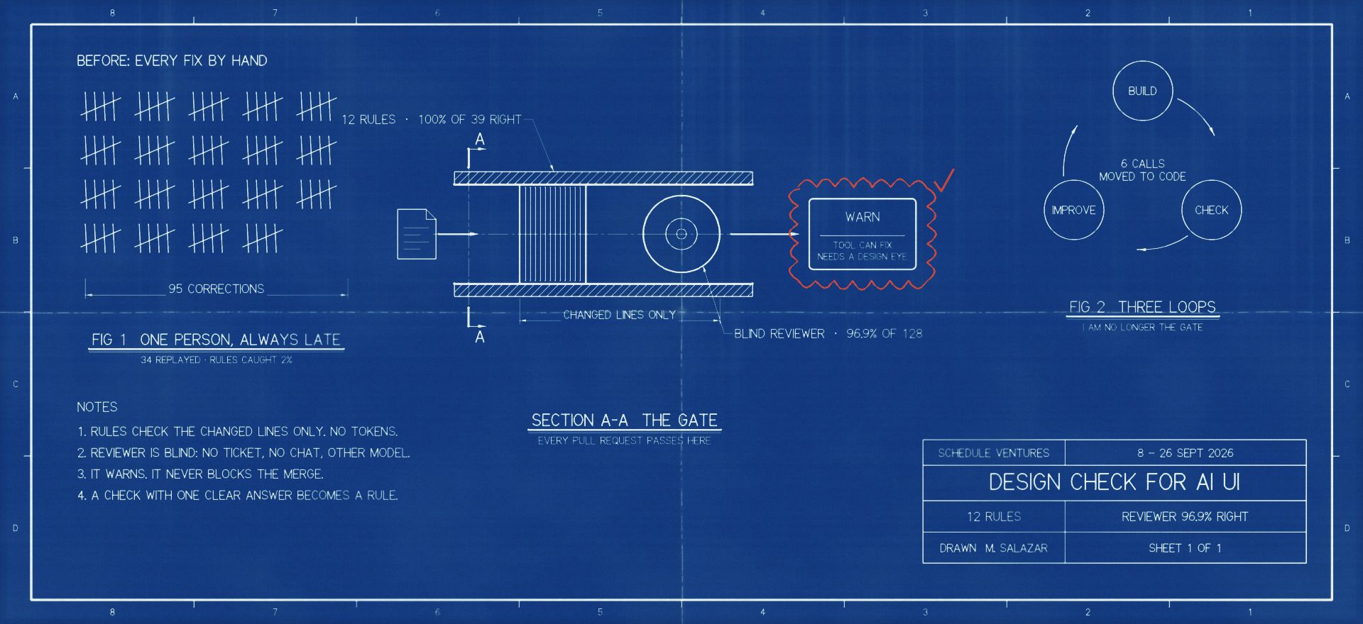
Each fix takes a minute. But AI agents on other teams build most of our screens now, and they repeat the same small mistakes. By September I had fixed 95 by hand, always after the PR was open. Automatic code checks (lint rules) looked like the answer, but my first six caught one mistake. I was the design system’s only safety net, and I was always late. I wanted my review to happen before the work got to me.
So I proposed a design check in CI, next to ESLint and the other checks that run before a PR merges. The AI Dev and the PM asked how much it would really catch. My answer was a loop: anyone can report a layout issue it missed, and it can become a new rule.
The problem
A pull request opens. I look at it, and I see the wrong font again. Then a gap that is not on our spacing scale. Then a plain MUI component where a component from our design-tokens package (we call it dt) already exists.
Each fix takes a minute. But the fixes never stop. AI agents on other teams build most of our UI now, and they make the same small mistakes. They had the same frontend skills installed as I did, and they still missed these things. By September I had made 95 of these corrections by hand, always after the PR was open.
So I was the design system’s only safety net, and I was always too late. My goal was not to write another rules document. It was to make the review in my head happen automatically, before the work got to me.
At first this looked easy. Sixty of my 95 corrections were the kind of thing an automatic code check (a lint rule) can catch in principle. So I wrote six lint rules. Together, they caught one.
That number told me something was wrong with my idea of the problem. The agents did not fail at UI. They usually picked something that was allowed. They just picked the wrong allowed thing for that place. And all they had to go on was prose: our design skill was a page of written rules. A CHI 2026 study compared ways to give agents design context. A structured component guide (a registry) got 95% compliance. Prose rules in the prompt came last.
The real knowledge was in my head: which dt component, which variant, which icon and which width belongs here. Nobody else could apply it, and I applied it after the fact.
The numbers showed this too. I ran the finished rules on 30 merged PRs, with 280 UI files and 16,238 new lines. They found 74 issues, about one for every 200 new lines, and 14 PRs had none. Half were font and text-style values typed in by hand. 34 of the 74 were on one internal icon audit page, not on product UI. I already fixed most of the common mistakes by hand. The rules are there to keep them fixed as other teams make new work. The cheap mistakes were real but rare. The expensive ones were choices.
The scope stayed small on purpose. This is not an audit of the whole site. The test set is the screens and flows that I corrected, plus those 30 merged PRs. New layouts will bring mistakes that the rules never saw.
What I had to work with
- We are three people, with no design team to share the reviews.
- The old code already had 751 warnings in 388 files. A blocking check would fail on day one.
- Another team owns our component library. My kit had to sit beside it and never change it.
- The check had to advise, not block. A gate that a team did not agree to gets switched off within a week.
- I did not control the other teams’ agents, their prompts or the skills they installed.
- One AI review costs 150k to 200k Opus tokens and two to six minutes for each PR. It could not run on everything by default.
- My test set was 34 correction moments from my own sessions. Nobody labelled a PR from another team before we decided to release.
The idea was mine. I proposed it to the AI Dev and the PM as one more check in CI, next to ESLint and the other checks that run before a PR merges. I designed and built the kit alone. The AI Dev connected it to our build pipeline, so it runs on each PR. The product screens and the component library belong to other people.
My role
The idea was mine. I proposed the design check to the AI Dev and the PM as one more check in CI, next to ESLint and the other checks that run before a PR merges. Then I built the kit alone: the 12 rules, the guide to 15 components, the 37-point design checklist (the rubric), the AI reviewer’s prompt, the test set, the scoring scripts, and the design skill that the agents load. The AI Dev set up the repo, the publishing, CI and the step that runs on each PR. Anyone with write access can change the guide and the checklist with a PR. The frontend product work, dt and the other teams’ prompts were not mine.
The agents did not break the rules. They picked the wrong right answer.
Then I replayed 34 of those corrections. My rules missed 22, all for one reason. The agent picked an allowed option that was wrong for that place, like the larger body text where the smaller one belonged. A rule can check that a value is allowed, but not which one a place needs.
A second AI that saw only the code change caught 24% of my corrections. My rules caught 2%.
So I measured before I built more. I replayed 34 of my corrections, and my rules missed 22, all for one reason. The agent never used a value from outside our system. It picked an allowed option that was wrong for that place: the larger body text where the smaller one belonged, or an info note where an alert belonged. A rule can check that a value is allowed. It can’t tell which allowed value a place needs.
Then I tried a second AI that saw only the code change, with no ticket and no chat. Before any tuning, it caught 24% of my corrections. My rules caught 2%.
On 30 PRs that had already shipped, my rules found about one mistake in every 200 new lines. The cheap mistakes were real but rare. The expensive ones were choices.
I measured before I built more
Instead of writing more rules from memory, I replayed 34 moments from my own sessions where I had corrected an agent. I rebuilt each one as it was, and I ran my checks on it. I also ran them on 30 merged PRs, and I looked at how others solved this. The CHI study tested the component guide. Mews measured adoption. Atlassian and Polaris ship their lint rules as a package next to the design system. And shadcn gives agents four layers (registry, skill, llms.txt, DESIGN.md) but enforces nothing, which leaves the checking to the team.
The replay showed me what I had missed. My rules missed 22 corrections, and every miss was the same kind. The agent never used a value from outside the system. It used a value that was allowed, but wrong for that place:
- a different dt icon, where the code already used a dt icon
body1text wherebody2belonged- a gap from the scale, but the wrong one
- an info note (
InfoNote) where an alert (Alert) belonged
A rule can check that a value is allowed. It cannot tell which allowed value a place needs. That was what my corrections were about.
The second surprise came from a blind AI review. I gave the same 34 moments to a separate model, with no ticket and no chat, only the change. Before I tuned its checklist at all, it caught 24% of my corrections. My rules caught 2%.
It caught things that no rule could see: the parts of a modal, missing copy that explains why something appeared, the order of a meta row, and what an icon means. It missed choices that only show on a rendered screen.
So the plan turned upside down. The rules became the floor that catches clear-cut mistakes. The component guide and the AI reviewer moved to the center.
Measure first, then build the gate
Rejected: Ship a check that blocks the PR right away.
Why not. Nothing to measure it against, 751 old warnings, and rules written from memory.
Rejected: Write more rules into the design skill.
Why not. That was what we already had, and the CHI study ranked it last.
The replay turned my 95 corrections into 51 checklist items: 14 that a rule can check, 29 that need the code change, 5 that need the screen, and 3 about process. The 2% was the number that changed the whole build.
Cost: three weeks before anything was enforced, and a test set that measures my work, not other teams’ work.
Rules for the clear cases, an AI reviewer for the rest
Rejected: Only rules.
Why not. They caught 2%, and they cannot see which allowed choice is right.
Rejected: Only the AI reviewer.
Why not. Too expensive, different answers on each run, and it cannot see the rendered screen.
Six checks earned a promotion: modal width, status words, group labels, spacing in a modal body, captions used as body text, and checkboxes for picking many. After that, the rules agreed with 53 of the reviewer’s findings. They found 24 more on their own, and all 24 were real. The 12 that only the reviewer found were the blind spots of each rule. That gave 12 rules and 14 tests.
Cost: two systems that must share one vocabulary, and a reviewer that still stops near 60% of my corrections.
Warn, never block, and ask one question
Rejected: A check that blocks the PR.
Why not. It would fail on the old code on day one, and the team would turn it off.
Rejected: A dashboard of violation counts.
Why not. Mews found that counts measure debt and people ignore them. What changed behavior was coverage.
The findings were accurate enough that a warning would be taken seriously. Labelling 128 findings took 4 hours 14 minutes. Findings that came up in only one of the reviewer’s two passes had no false alarms. They only suggested the wrong fix more often: 12 of 51, against 7 of 77 for findings from both passes.
Cost: it only works if people answer. A question that nobody answers is filed with no verdict. And nothing is enforced until the team trusts the report.
Their doubt became the improvement loop
When I proposed the check, the AI Dev and the PM had one doubt: how much will it really catch? It was a fair question. The product keeps growing. New features bring new layouts, and new layouts bring mistakes that no rule has seen yet.
So I made the check able to learn. Anyone on the team can report a layout issue that it missed. When a reported issue has one clear answer, it gets promoted to a lint rule. The check doesn’t have to know everything on day one, because it grows with the product.
Build, check, improve: three loops so I am no longer the gate
Before: an agent builds a screen, I fix the same mistakes by hand, and what I know stays in my head.
After: three loops. The agent builds with the guide, the PR gets checked, and every answer makes the checks better.
- Build it right the first time. Before it touches UI, the agent loads the design skill. The skill reads the component guide: which component to use, its props, and the traps.
- Check the PR, never block it. 12 lint rules check the changed lines. They cost nothing and write a short report for the PR. A blind AI reviewer reads what a rule cannot.
- Get better with every answer. Every finding and every Fix or Ignore reason is filed and becomes a label. Anyone on the team can improve the guide and the checklist with a PR.
Build it right the first time
- Before it touches UI, the agent loads the design skill. The skill reads the component guide: which component to use, its props, and the traps.
- Everything is built on dt. When dt is missing something, the gap goes to the dt team. Nobody patches it locally.
Check the PR, never block it
- 12 lint rules check the changed lines. They cost nothing and write a short report for the PR. A blind AI reviewer reads what a rule cannot.
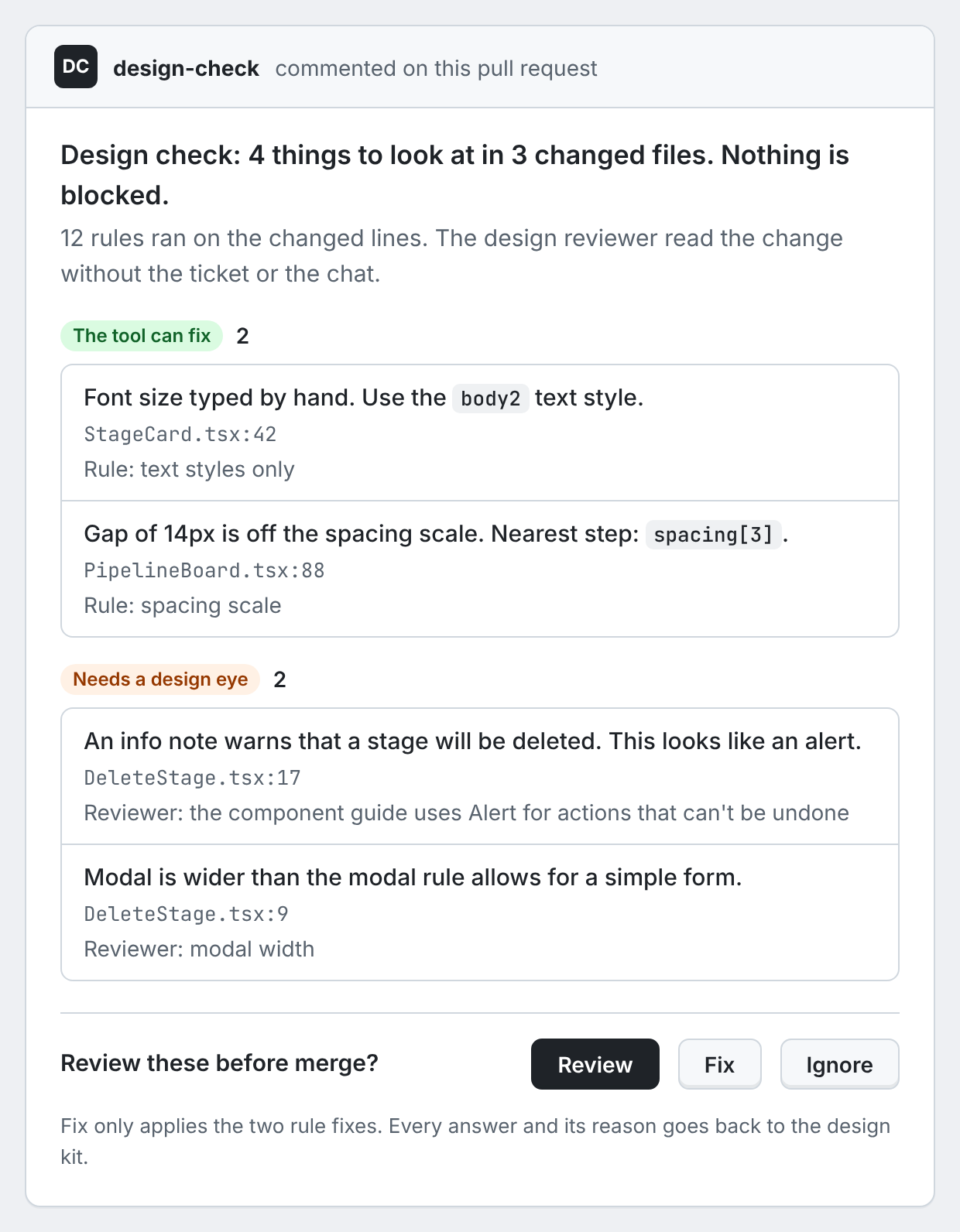
- The developer sees two groups, "the tool can fix" and "needs a design eye", then picks Review, Fix or Ignore.
Get better with every answer
- Every finding and every Fix or Ignore reason is filed and becomes a label. Anyone on the team can improve the guide and the checklist with a PR.
- So far: the rules were right every time, the reviewer 96.9% of the time. Six checks have moved from the reviewer to a rule.
design-tokens (dt)npmGitHub Packages
Our design system package. Another team owns it. The kit sits beside it and never changes it.
- To : components used
Claude Code agent
An AI agent on another team. It builds the screen and opens the pull request.
- From : loaded first
- To : builds UI, opens PR
Pull request
The UI files the agent changed, compared with the main branch (origin/qa).
- From : builds UI, opens PR
- From : components used
- To : runs on the PR
Design checkpr-it step 2b
A step that runs on every pull request. It runs the rules and the AI reviewer, then asks the developer one question.
- From : runs on the PR
- To : report + one question
- To : changed lines (
npx design-tokens-kit lint --changed) - To : changed files
Review · Fix · Ignore
A short report in two groups, "the tool can fix" and "needs a design eye". Then one question. The PR never waits on it.
- From : report + one question
- To : answers filed
Design skill
The instructions the agent loads before it touches any UI. It lives in the design-tokens-kit repo. Published as @schedule-closings/design-tokens-kit on GitHub Packages.
- From : what to use where
- To : loaded first
12 lint rules--md report
Automatic checks on the changed lines only. They catch the mistakes with one clear answer, like a wrong font or an off-scale gap. It lives in the design-tokens-kit repo. Published as @schedule-closings/design-tokens-kit on GitHub Packages.
- From : changed lines (
npx design-tokens-kit lint --changed)
Blind AI reviewerwarn only
A second AI, on a different model from the builder. It gets no ticket and no chat, makes two passes, and points to the file and line. It only warns. It lives in the design-tokens-kit repo. Published as @schedule-closings/design-tokens-kit on GitHub Packages.
- From : changed files
Component guide
What the agent should use where: 15 dt components with their props, habits and traps, plus the 37-point design checklist. It lives in the design-tokens-kit repo. Published as @schedule-closings/design-tokens-kit on GitHub Packages.
- From : better rules and guide
- To : what to use where
Learning loop
When the labels show that a check has one clear answer, the check becomes a lint rule. It lives in the design-tokens-kit repo. Published as @schedule-closings/design-tokens-kit on GitHub Packages.
- From : labels
- To : better rules and guide
design-eval
The record. Every finding and every Fix or Ignore reason lands here. It lives in the design-tokens-kit repo. Published as @schedule-closings/design-tokens-kit on GitHub Packages.
- From : answers filed
- To : labels
Everything is built and measured. The step that runs on each PR is handed off, but it is not live yet.
Every answer goes back into the kit. When a check always gets the same answer, it becomes a rule.
By the end of the three weeks, the kit, the rules, the guide, the checklist and the AI reviewer were built and measured. The PR step and its review page were designed and handed off. A test version of the page exists.
Build. Before an agent touches UI, it loads the design skill (frontend-ui-design-rules) and the component guide. The guide covers 15 dt components: their props, how we use them, and the traps. When a component or a rule is missing, the gap goes to the dt team. Nobody patches it locally.
Check. On each PR, one command runs the 12 rules on the changed lines only: npx design-tokens-kit lint --changed --base origin/qa --md. It costs no tokens, and it writes a report that pastes straight into the PR. Then the blind reviewer makes two separate passes over the changed files. It runs on a different model from the one that built the UI, so it never grades its own work. It sees no ticket and no chat, it points to the file and line, and it only warns.
The developer gets one line that says what happened, then two groups (“the tool can fix” and “needs a design eye”), then one question.
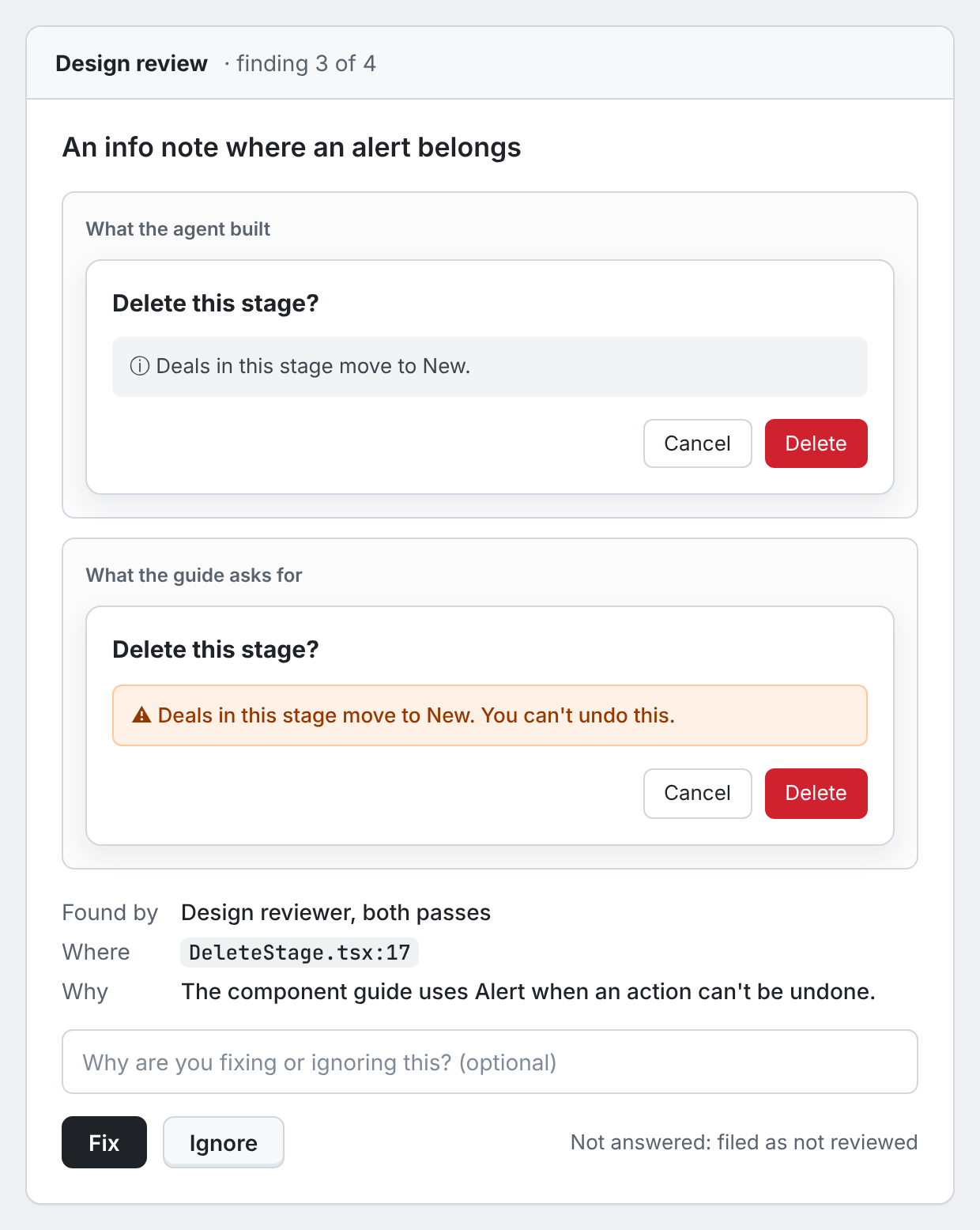
Improve. Review opens a page with one card for each finding and a before and after picture. Fix and Ignore record a verdict, and an unanswered card is filed as not reviewed. Simple fixes apply automatically where a fixer exists. A fix from the AI reviewer never applies until a person picks Fix: its suggested fix was right 85% of the time, and the other 15% are design calls. Every finding and every reason goes to design-eval, the kit’s record. When the labels show that a check has one clear answer, it becomes a rule.
Why it works this way
- The agent reads the component guide first, not the written rules. The 22 misses were gaps in the guide, not in the rules.
- The rules only look at changed lines. The 751 old warnings stay a number to burn down, not a blocker.
- The reviewer is blind and runs on a different model, so it is not grading its own output.
- Fix is offered only where the answer is one token or one import. The 85% is the reason everything else stays a report.
It catches the cheap mistakes first. It does not replace looking.
| Metric | Before | After | Window |
|---|---|---|---|
| Rule flags that were right | No rules | 100% of 39 | 15 September |
| AI reviewer flags that were right | No reviewer | 96.9% of 128 | 16 September |
| My 34 corrections caught | 2% with rules | 35% with the reviewer, ceiling near 60% | 15 September |
| Design calls made by code | 6 rules | 12 rules, 6 promoted | 16 September |
| Cost of the rule check | No check | No tokens | 16 September |
My release bar was an 80% catch rate with under 20% false alarms. Accuracy cleared it. The catch rate did not.
The reviewer caught 35%, and it can never get much past 60%. Some corrections cannot show in a code change at all, so the check ships as a warning.
The 96.9% is the best case, too. I labelled the findings myself, and 76 of the 128 verdicts were copied from one card to similar ones.
Those are corrections like which gap value, which color step, what the copy should say, and an icon color in dark mode. Promoting checks to rules is the way forward, not a promise.
One test keeps me honest. An agent built a new Pipeline page with the design instructions and the guide. It shipped five mistakes. The rules found none of them. Looking at the page found all five. The check is a floor, not a replacement for a designer’s eye.
The accuracy numbers have a limit too. Of the 128 verdicts, 76 came from applying one card’s verdict to similar cards with the same check and note. So 96.9% is the best case. When I fixed one mistake in the checklist, the reviewer’s score fell from 100% to 96.9%.
These are numbers about the tool, not the business. What I can defend is smaller: six of 37 checks no longer need a person, and cheap mistakes get caught before review.
Three weeks in, version 0.1.0 was on GitHub Packages on 16 September, and 0.1.4 by 26 September. The frontend team’s install PR was unblocked the next day. The PR step is handed off, but it is not live. The next thing to measure is rework on other teams’ PRs, and nobody has measured it yet. New layouts are outside the test set, so the checks will need the loop to keep up.
Six things that once needed my eye now fail a rule. The rest is the loop.
What I would change: I would build on a robust, widely used component library, such as shadcn or Base UI, instead of our own. Maintenance turned out to be the hardest part.
What I would do differently
Honestly, I would start from a robust, widely used component library, such as shadcn or Base UI. Maintenance turned out to be the hardest part of this work.
Every component we own needs its guide entry and its checks kept current. A mature library comes with most of that work done.
Each component that we own also needs its entry in the guide and its checks, and they must change every time the component changes. A mature library already has well-tested components and docs, and other people keep them current. Then the kit only has to cover our own choices on top.
I tested on my own corrections first. So the 100% for the rules and the early reviewer number come from my own work, with some verdicts copied across similar cards and some labels made from text alone. That is selection bias, not proof that the tool works. Before I call the accuracy done, I would label 15 to 30 PRs from other teams, one finding at a time, with the screen in front of me.
I also set the wrong bar. I asked for 80% of corrections from a reviewer that can never pass about 60%. That bar would have killed the part that produced six of the 12 rules. The better bar is accuracy first: 95% or better for the reviewer, 100% for the rules, and a separate measure of rework on other teams’ PRs.
And on big changes, I would review one file at a time. When a change grew from one file to ten, the reviewer missed four things it could have caught. It lost them to attention, not to ability. One call for each file costs more, but nothing competes for its attention.
The short version
Problem. I made 95 design corrections to agent-built UI by hand. Sixty looked like rule material, but my first six rules caught one. The real knowledge was which allowed option fits a place, and only I had it.
Decision. Measure the corrections before building a gate. Use rules for clear-cut mistakes and a blind AI reviewer for structure, copy and component choice. Warn, never block, and file every answer back as a label.
Constraint. 751 old warnings, one reviewer, three weeks, and an AI review that costs 150k to 200k tokens.
Outcome. 12 rules that were right every time, a reviewer right 96.9% of the time, six checks promoted from judgment to code, and a catch rate of 35% with a ceiling near 60%. The check warns, the loop learns, and my review job got smaller.
Why not block the PR? A gate that the team did not agree to gets turned off, and the old warnings would make it fail on day one. The warning is credible because it is accurate. Whether to enforce it is a later decision, and it belongs to the team.
Why only 35%? A code change cannot show values on screen, colors as rendered, or what the copy should say. The misses it could have caught came from attention on big changes, and one file at a time would fix them.
Evidence
design-evalreports 00 to 19, with the 34-moment test set, the labels and the scoring scripts.- The kit repo
schedule-closings/design-tokens-kit:registry/components.json,rubric/diff-checkpoints.json,eslint/index.mjs. - The system diagram:
design-eval/diagrams/design-tokens-kit.html, rebuilt above in the style of this site.